How we improved Airbnb's Product Detail Page through a number of small iterations over the course of a year.
Design is never done
02 Context
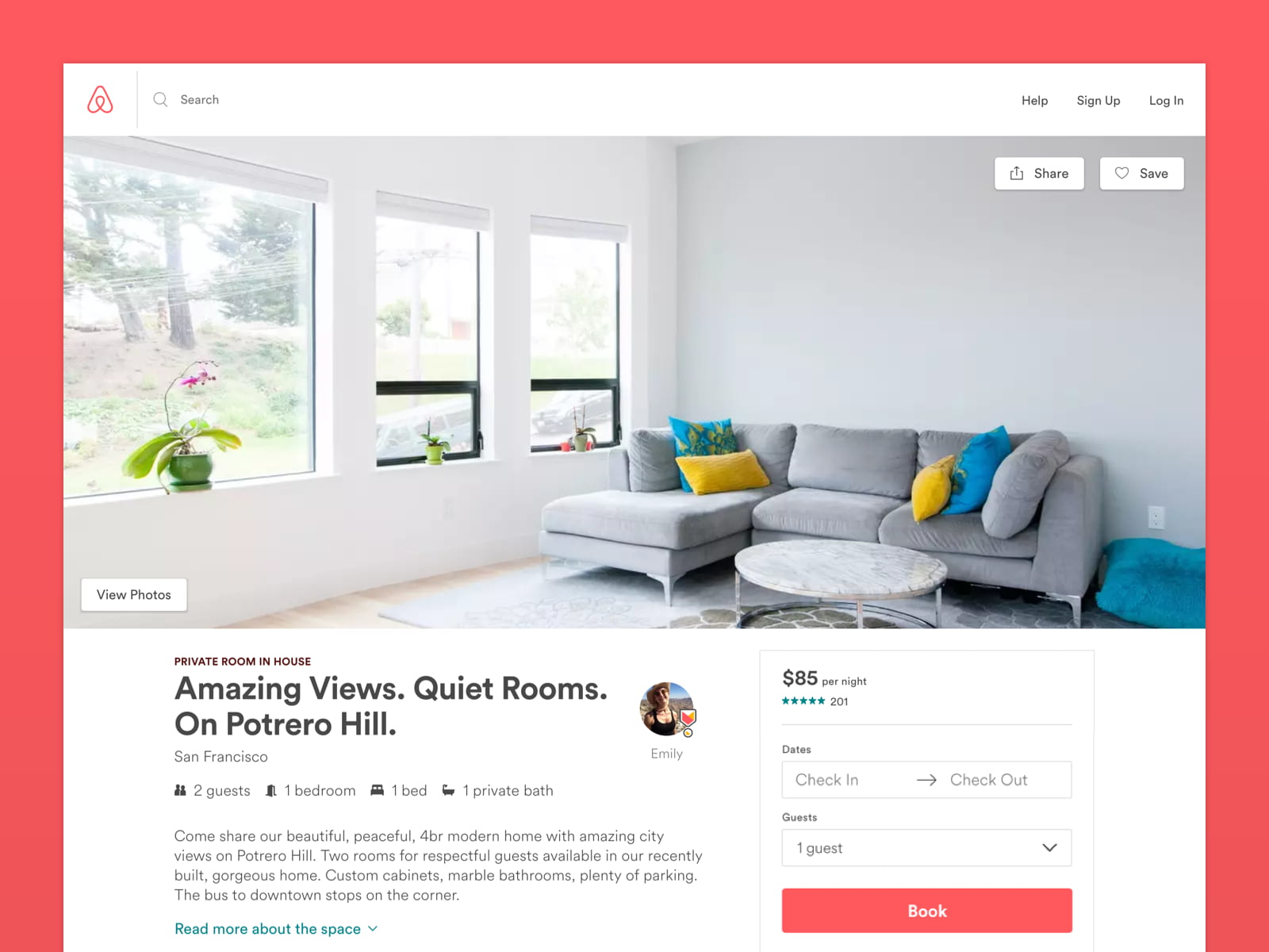
The problem.
In early 2017, we identified a number of redundancies and inconsistencies, as well as legacy UI, on Airbnb's Product Detail Page (PDP). Our team wanted to test new designs to remove these redundancies, ensure consistency across verticals, and update our front end with our new Design Language System. But how could we update one of Airbnb's most important pages without hurting conversions — or ideally even improve them?
03 Approach
The project.
After a long audit and brainstorming session, I worked closely with Jonathan Rahmani and the rest of the team, splitting each idea into over 30 small experiments that we would test over the year. The day-to-day progress appeared slow, but with persistence we were able to ship most of the experiments with positive results. After a year of working on the page, the improvement was significant. Here are some of the experiments I worked on.
04 Experiments
01
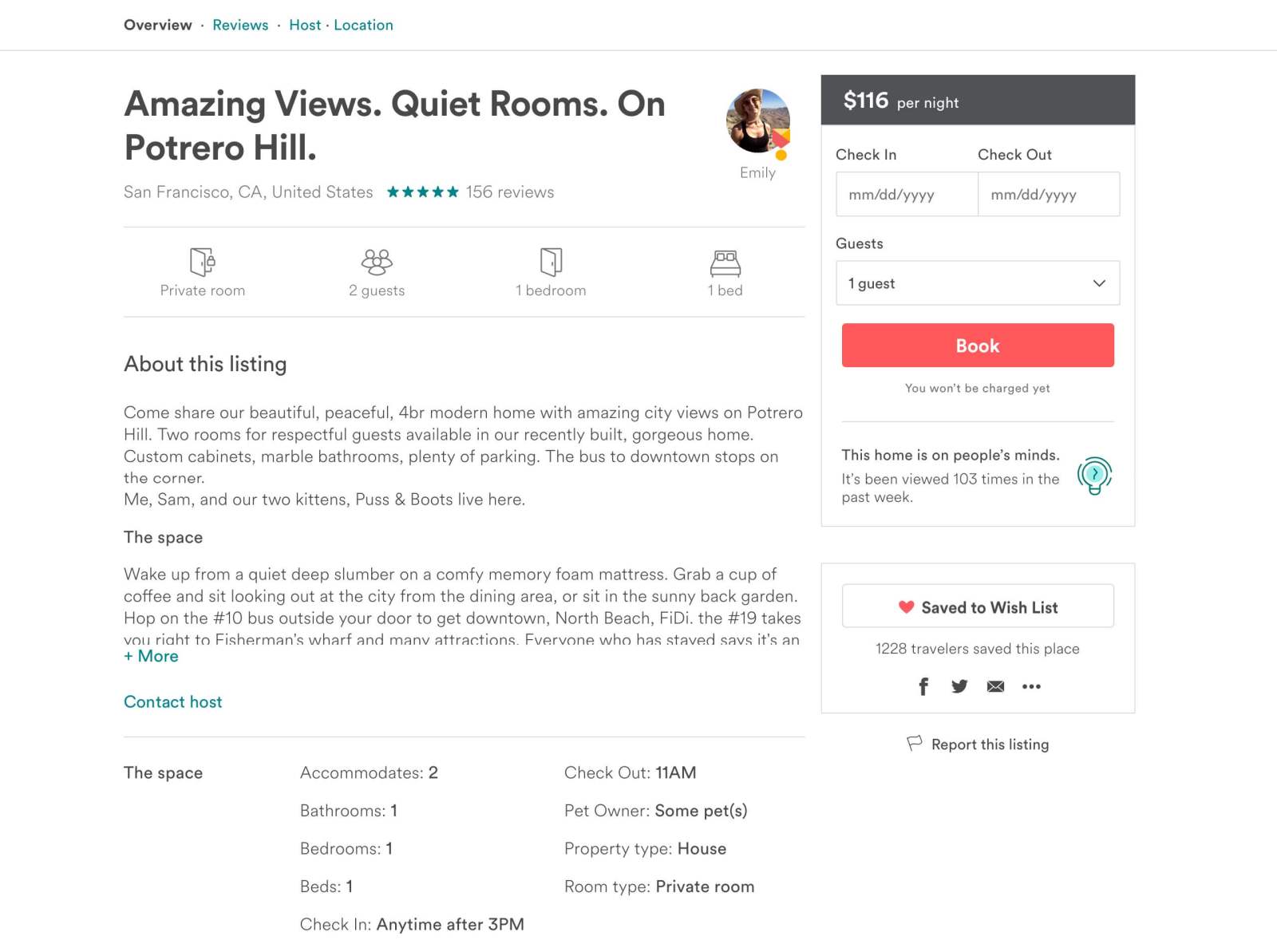
Reducing redundancies
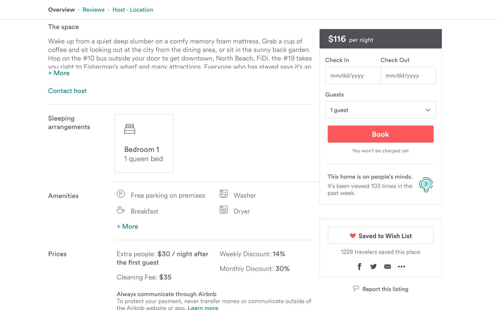
Airbnb's PDP had two "The Space" sections full of redundant content, taking up a lot of precious vertical space and leading to additional information processing for potential guests. I proposed a new simplified design by eliminating redundant content and rearranging the rest into more appropriate sections. I also proposed removing the "About this listing" title and switching the listing description icons for a smaller, bolder set to gain even more vertical space. After many iterations, we launched the experiment with a small improvement in conversions and a considerable reduction of cognitive load.
Before
After
Reducing redundancy
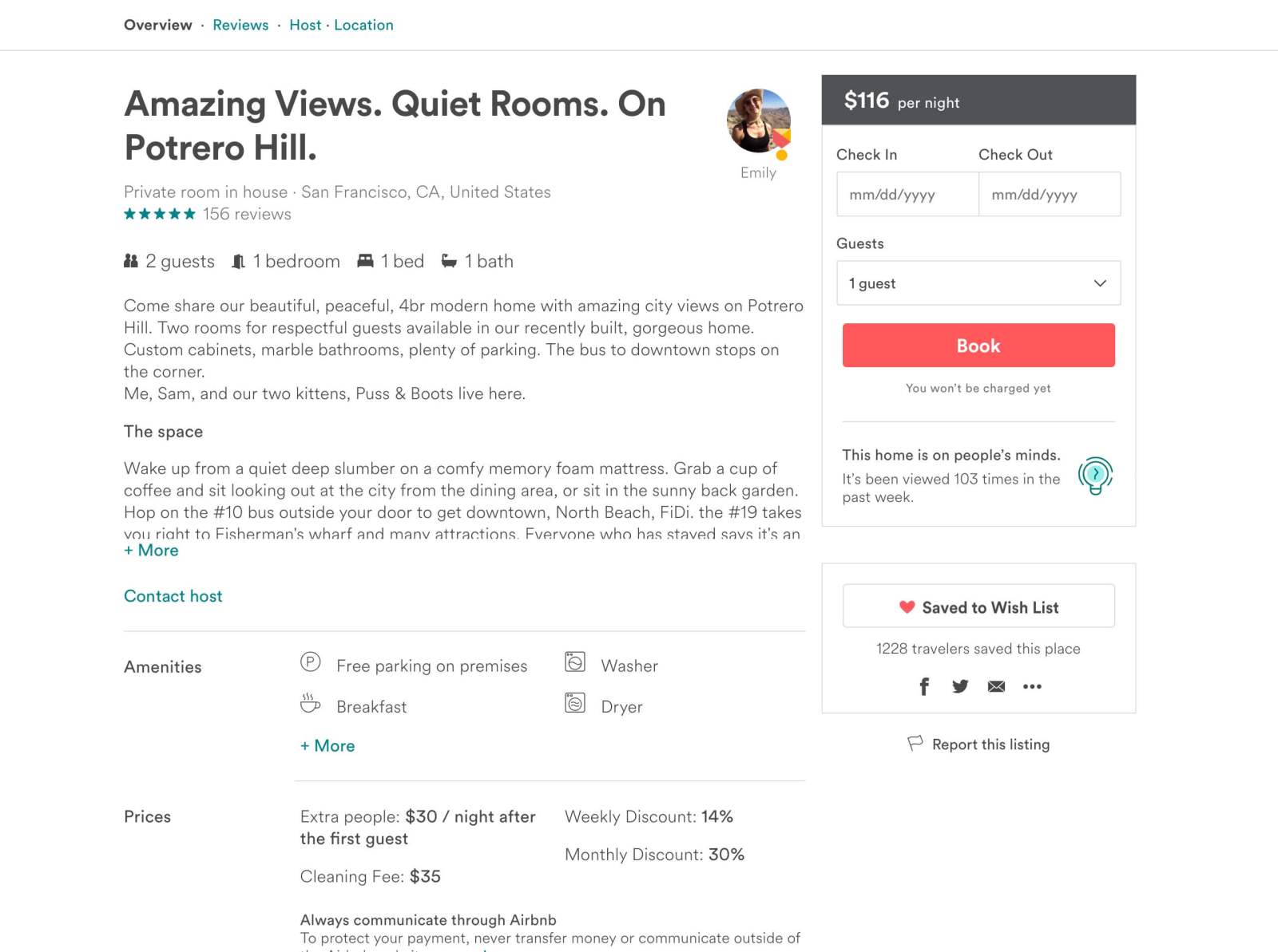
02
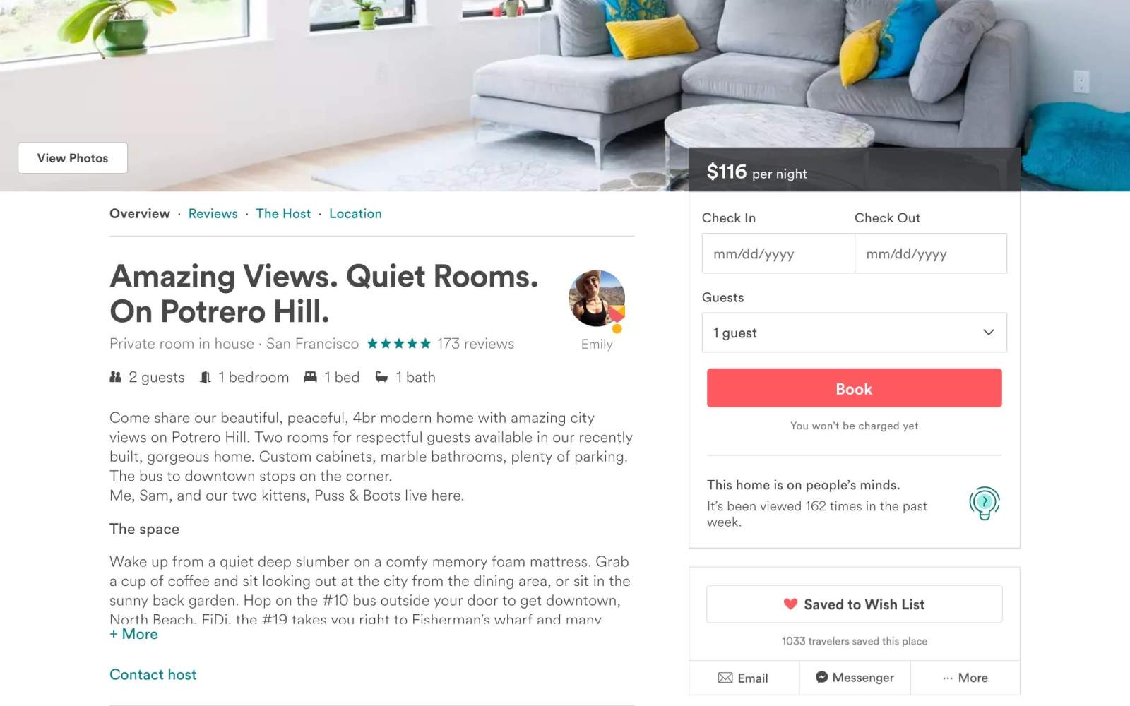
Sleeping arrangements
The research team showed us guests were interested in knowing the bed size and distribution, but the relevant information was too far down the page and unnoticeable. We tested highlighting the sleeping arrangement section with a new design to add clarity, and promoted it above the rest of the sections. This change had a direct positive impact on bookings.
Before
After
Sleeping arrangements
03
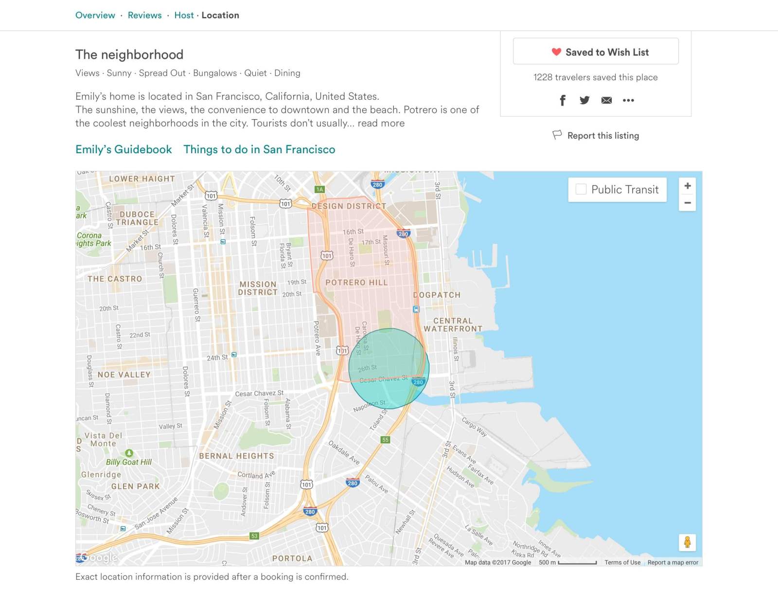
Map size
Location context is a key feature on Airbnb's PDP, but before, there was a huge map at the bottom of the page blocking the booking component further down. The hypothesis we tested was that we could reduce the map size without affecting the experience or conversions — allowing the booking component to remain in the sidebar. The experiment was successful and we launched it to the whole user base.
Before
After
Map size
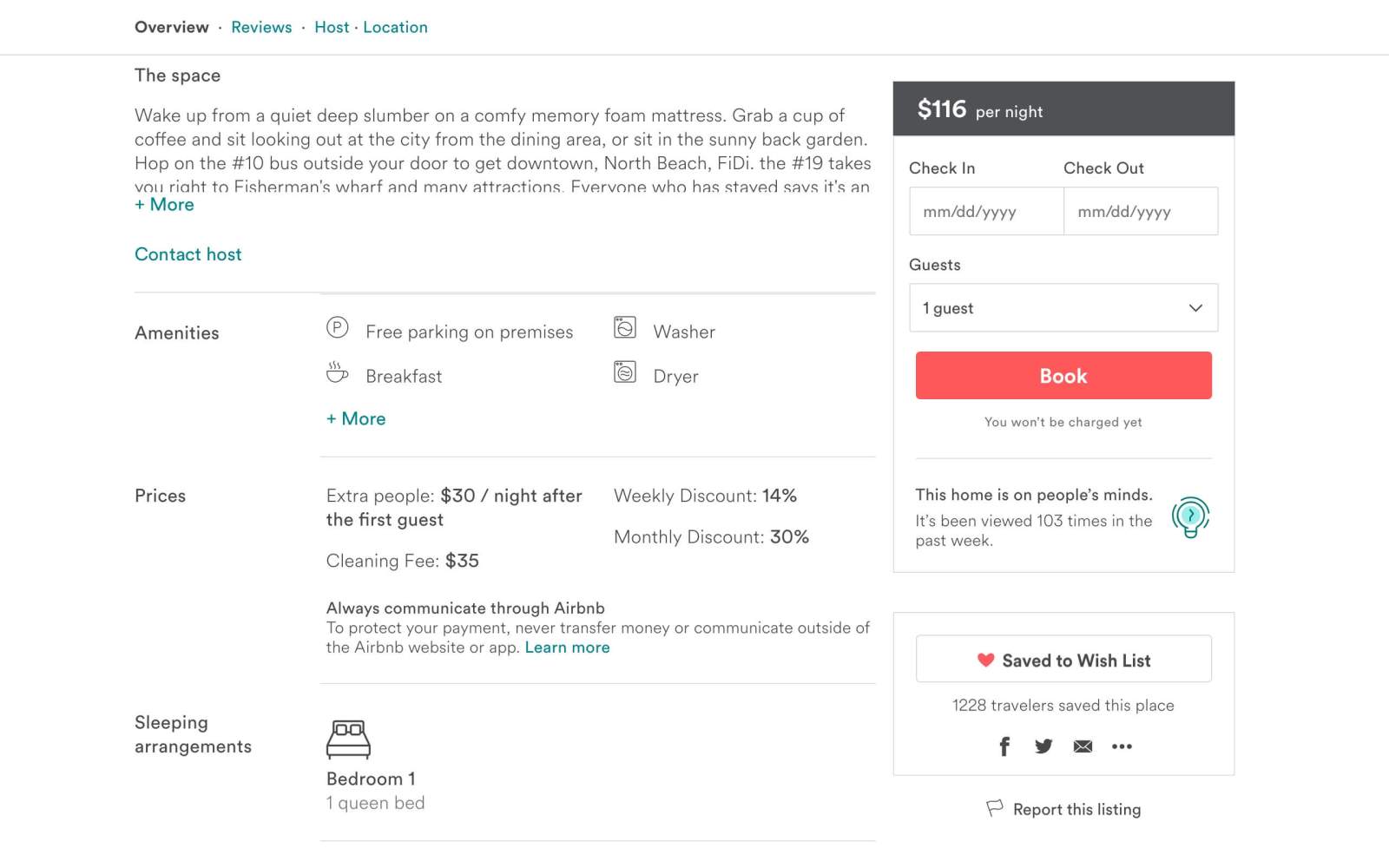
04
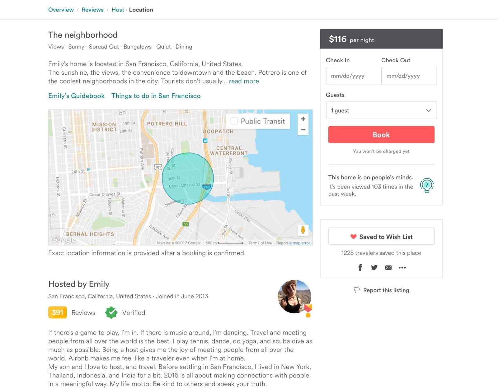
Booking component
The booking component — a critical piece of Airbnb's PDP — used legacy UI components. I proposed a new design using components and style guidelines from our Design Language System. After a number of iterations and tests, we successfully launched it to 100% of the user base. This change improved visual quality, brought consistency, and updated the technology behind each component.
Before
After
Booking component
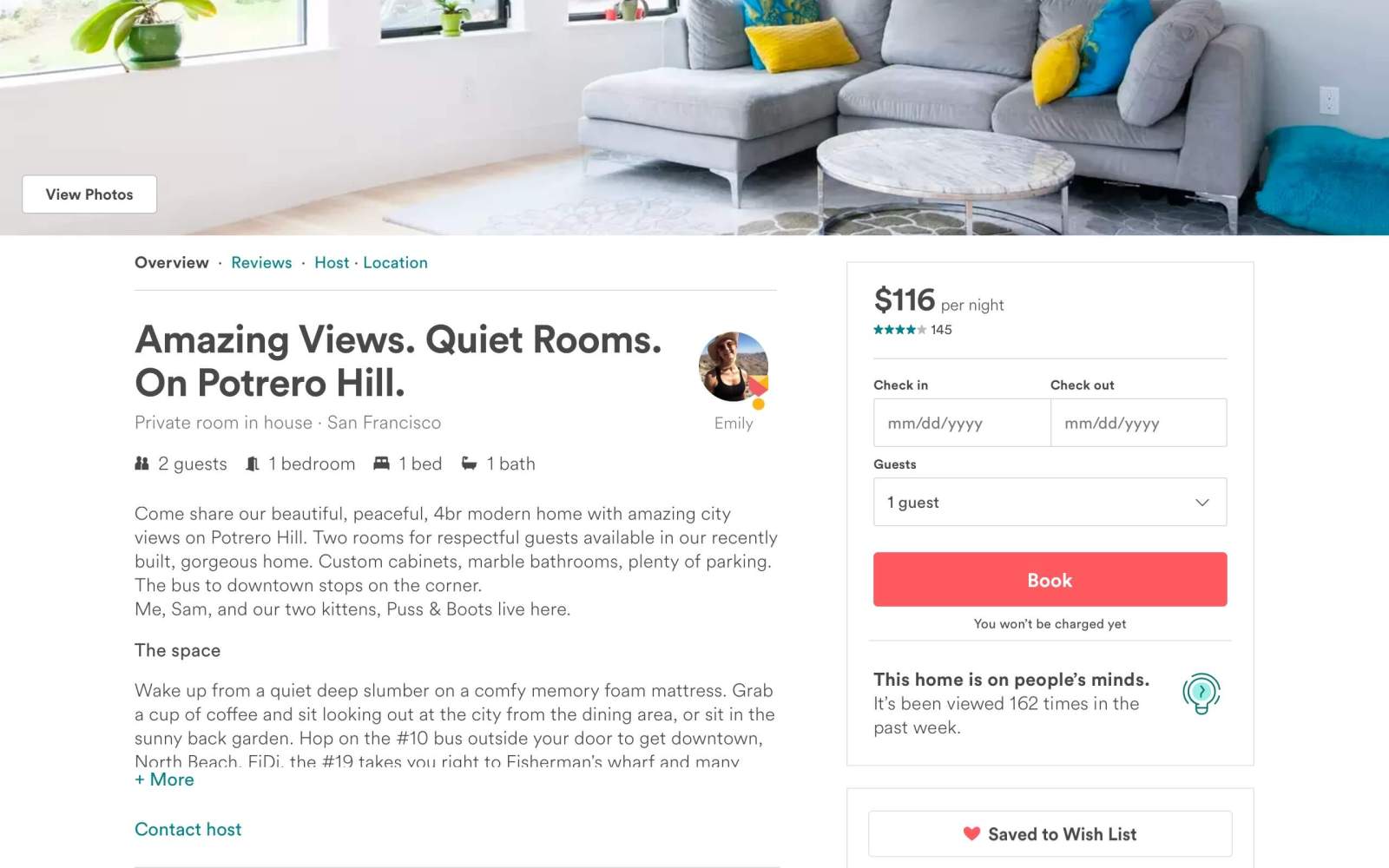
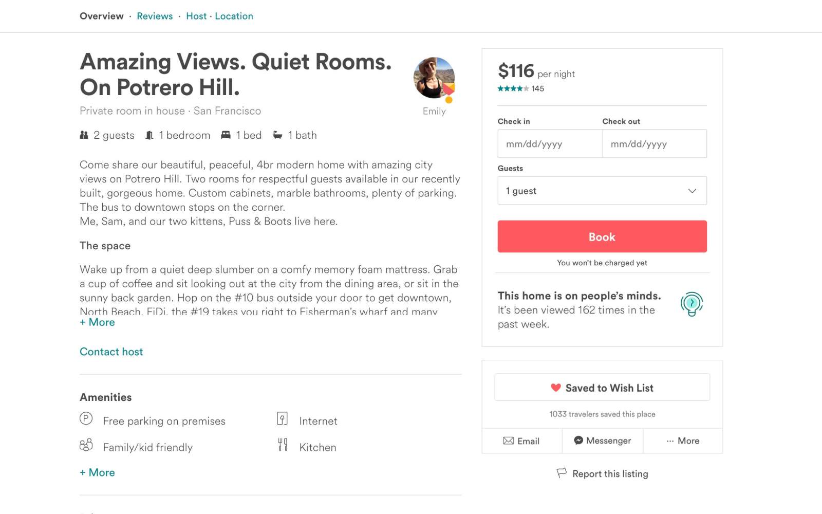
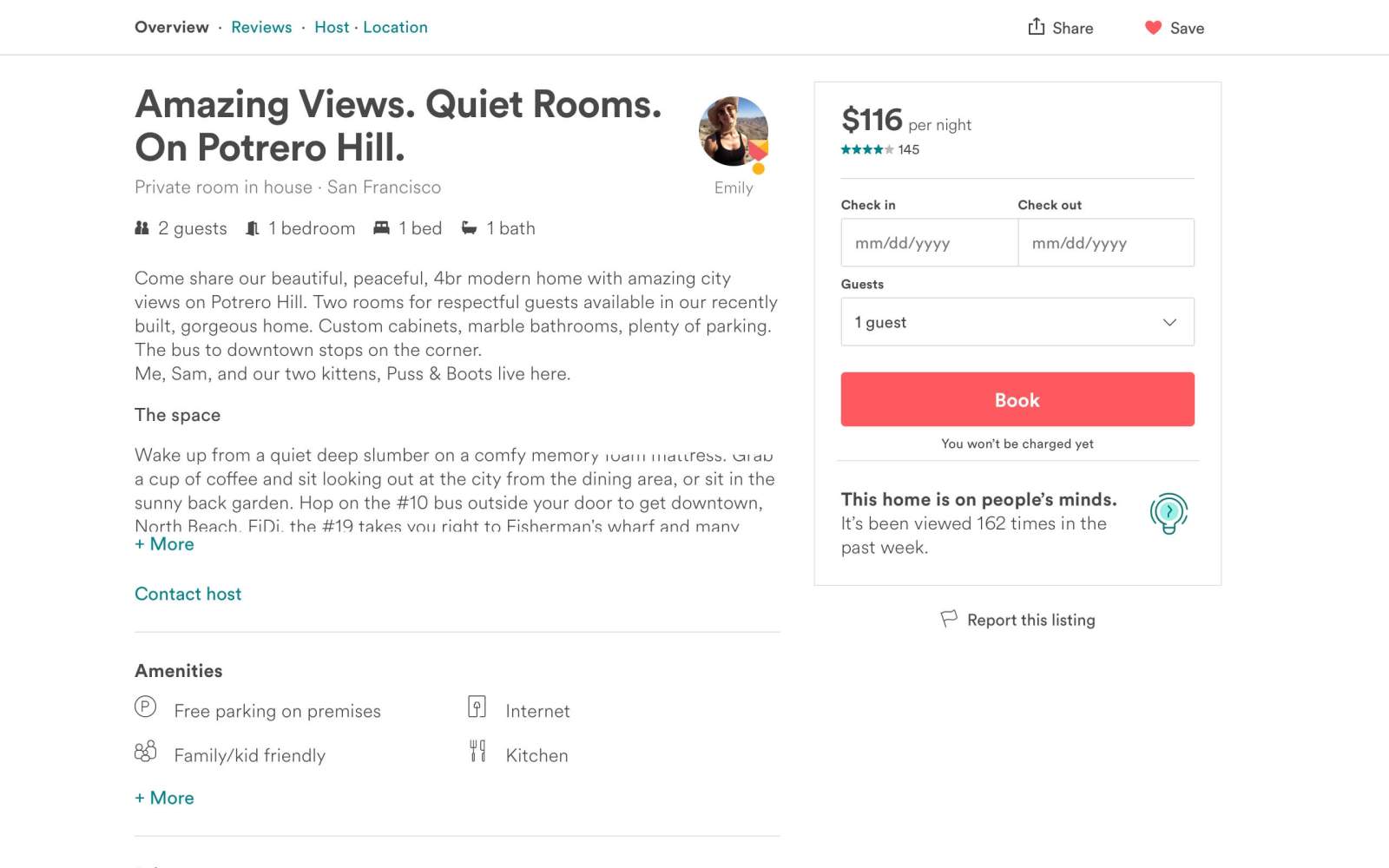
05
Share & save
Guests were having issues accessing the share and save buttons on screens with a low height. I proposed a new design to elevate these two actions and achieve consistency with how our native apps work. The experiment was a big success: guests started sharing and saving more homes.
Before
After
Share & save
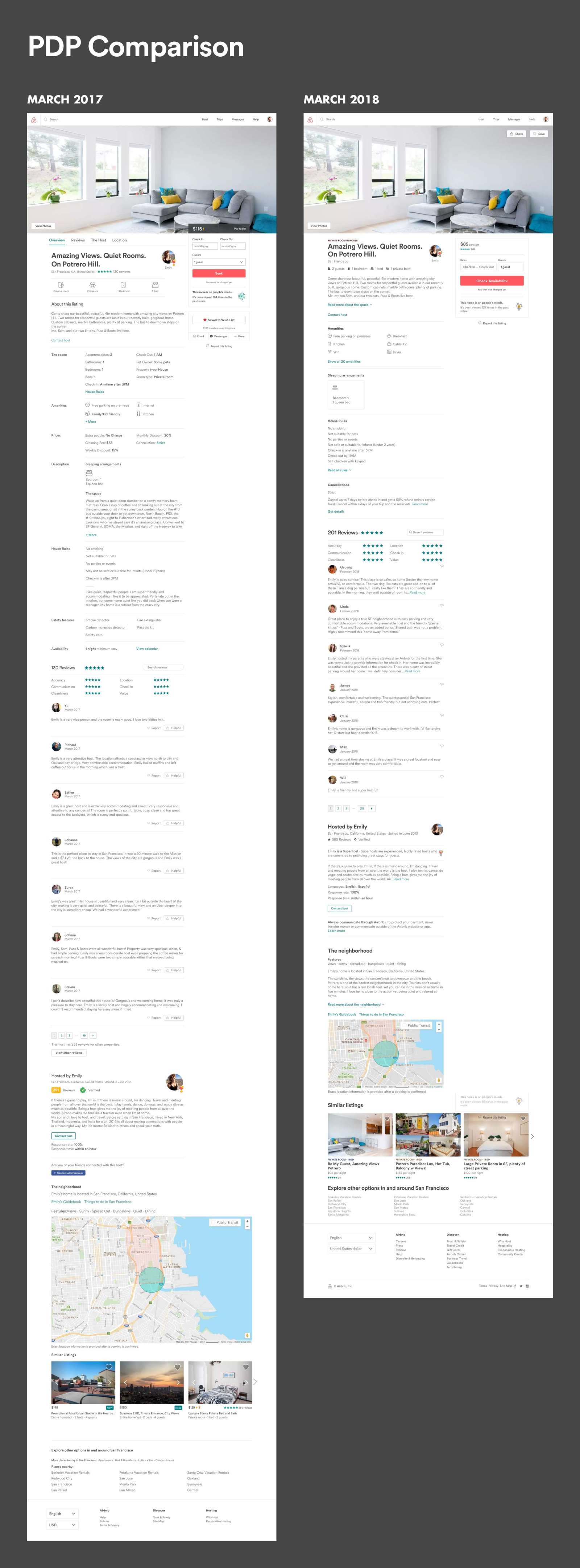
05 Wrap up
A year later.
Stepping back and comparing the page before and after a year of compounding iterations, the impact of many small, well-tested bets becomes clear.
Airbnb PDP — 2017 vs 2018
06 Words from peers
I am always so impressed with how quickly Wiki is able to complete last-minute design requests. Not only is he fast, but he delivers high-quality designs as well. This is super important for an engineer, because most of the time an edge case will pop up and the design has to be tweaked to accommodate it. Wiki always understands the situation immediately, and always has a solution ready for it.
— Former Airbnb engineer